What shades are classified as “light colors”?
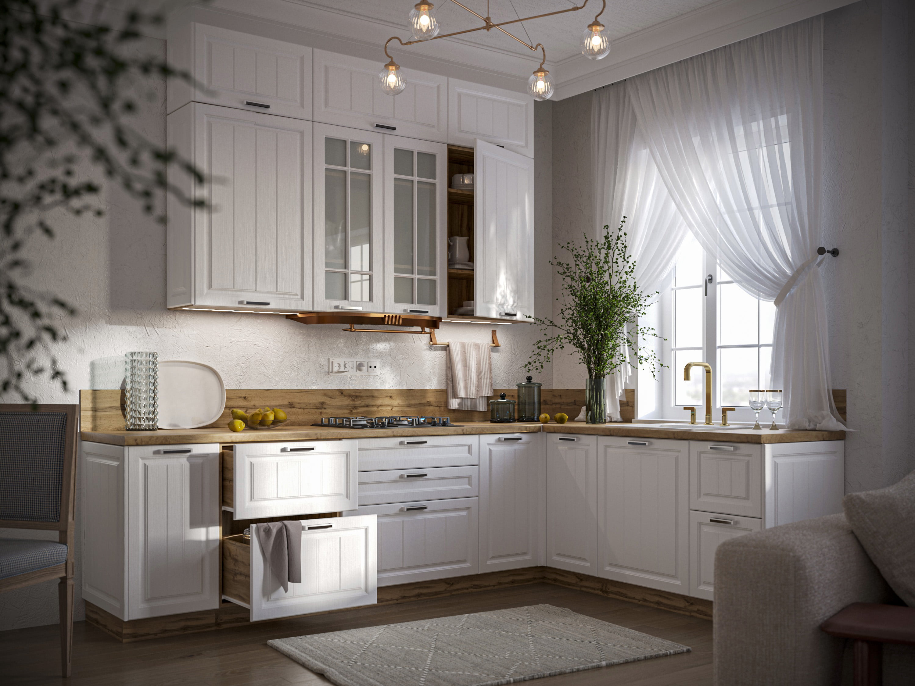
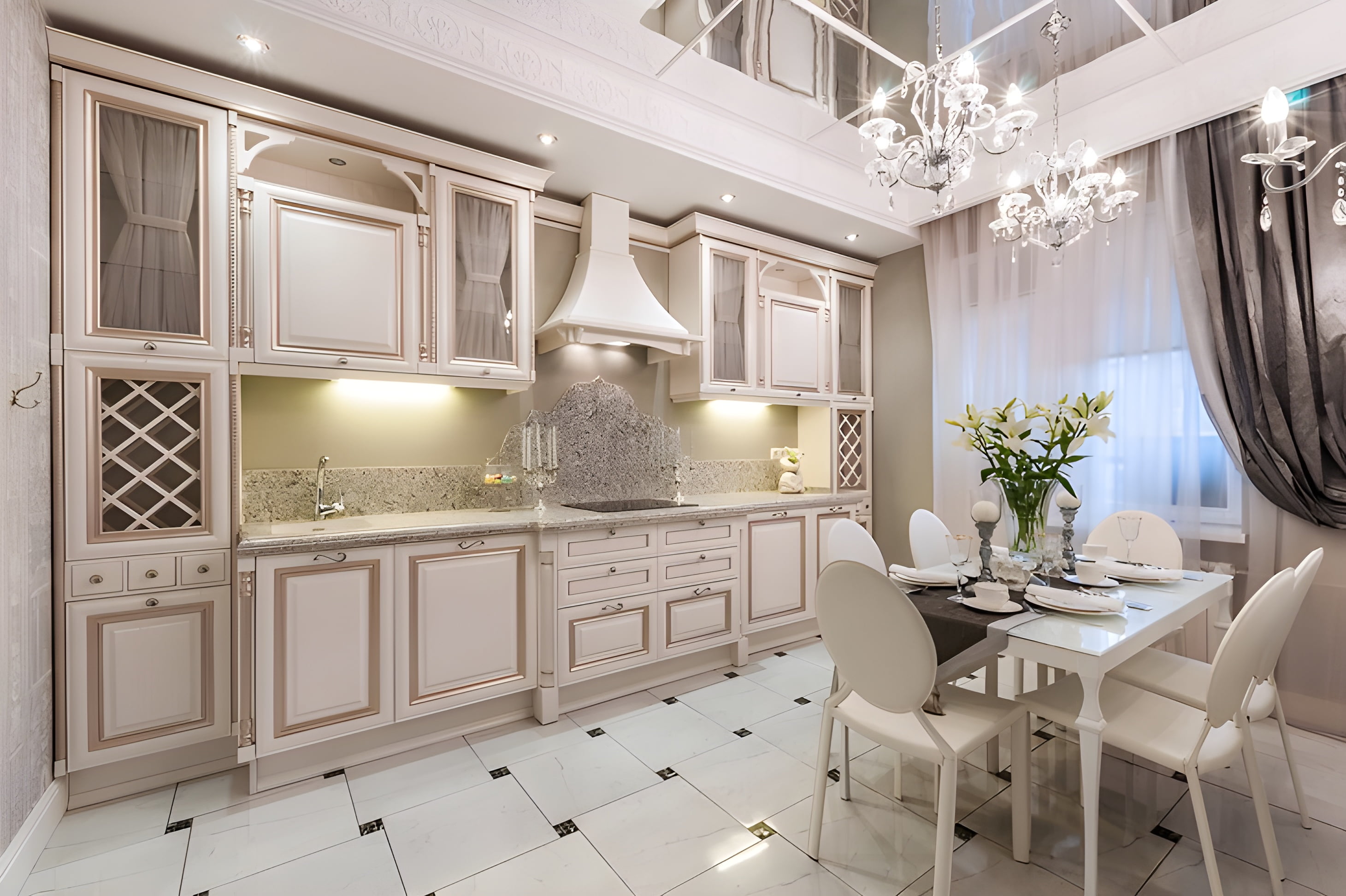
- White and its shades: snow-white frosty, milky, pearl, ivory or ivory.
- Gray and shades: steel, ash, light gray.
- Beige and cream range: vanilla, coffee with milk, caramel, light brown, peach.
- Pale shades: blue, turquoise, yellow, lilac, pink, green.
Light cold and warm shades fit into modern and classic interior styles, combined with dark and bright colors, among themselves.
What are the advantages of light colors in the kitchen?
- Pale and light gamma creates an atmosphere of psychological comfort and peace, these are colors that fill with strength and energy.
- The palette helps to relax, tune in to activities, and concentrate.
- Suitable for small and dark rooms, visually expand the boundaries, enhance lighting – this problem often has to be solved by the owners of apartments in old houses, where the area
custom-made kitchens do not exceed 7 sq.m. - Versatility in combination of shades.
- Most of the wide range of interior styles welcome the use of light colors.
Disadvantages of the kitchen interior in bright colors:
- Stained: white or beige backgrounds require constant care, because in the kitchen it is very easy to stain the surface with juices, fat, vegetables, coffee and other foods and drinks.
- Dullness: the total use of light color is the risk of making the interior completely uninteresting and dull.
- The effect of the hospital: this threatens those who choose a cold white shade and do not dilute it with bright colors.
To avoid many typical mistakes in interior design in light colors, be sure to think over bright accents and the style of the room.
Interior styles: how to use light shades correctly?
Classic
Classic style is the home of light colors. Pastel colors, white, ivory in combination with natural textures are actively used. Light shades dominate the base – as a finish for the floor, walls and ceiling. The kitchen set requires compliance with the aesthetics of the style – embossed patterns, gilding, natural materials are welcome, not recommended: metallic, chrome, gloss, artificial materials. The most popular shades: white, vanilla, pearl, olive, peach, milky. A contrasting wenge-colored set looks luxurious on a light background.
Hi-tech
High-tech style, in which the obligatory details are: metallic sheen, chrome plating, steel, glass, plastic, glossy surfaces. White color in a cold tone is used as a background for dark and bright colors – red, yellow, black, blue, green.
Minimalism
The name of the style speaks for itself – the interior often uses one background color with small, spectacular accents. The basic ones are white, red and black – moreover, furniture, floors, and walls can be white. In minimalism, it is recommended to use a cold range of light shades.
Provence
Light, airy, elegant style dominated by shades of ivory, white, cream. The light background emphasizes the spaciousness and visually expands the space, “raises” the ceilings. Green, blue, lilac are used as accents.
A certain percentage of light shades is present in all styles – art deco, baroque, modern, constructivism, loft.
For pastel colors, white, beige colors, it is easy to choose a texture – wood, natural stone, metallic and others.